

Here at Cision, public relations professionals ask us about press release templates all the time. But there's no one-size-fits-all solution. Instead, the key question is: “Why does this news matter?” Every release should answer that.
Especially if you want earned media coverage - making sure your press release is relevant for an audience of journalists is critical. In fact, journalists rely heavily on press releases: 74% want to receive them from PR teams, and 68% use them for story ideas. That’s according to our most recent State of the Media Report.
So, it’s worth making your press release stand out – and here’s how. Below, we’ve outlined the must-haves for your press releases, ways to get the most mileage out of each release, and how to understand if your efforts are paying off.
Must-Have Elements in Your Press Release
#1: Compelling Headline to Keep Them Reading
In addition to answering the “So what?” question right off the top, your headline should also include a positive action verb to convey the key message within the first 60 characters (for SEO purposes, you should always strive to keep your headline to 100 characters or less). This press release from BrightCheck, Inc. is a great example.
For evergreen content or thought leadership, lead with the story – not the brand (much like the Video Advertising Bureau did in this release). The unbranded headline is a great content marketing approach.
Finally, use a subhead to provide additional context - data points, event dates, etc. Get readers curious to know more.
#2: Clear and Concise Call to Action (CTA)
What do you want readers to do after engaging with your content? Make it clear by including a strong CTA that compels your audience – be it media, investors, or consumers – to take that next step (whether it’s following you on social media, signing up for an event, going to a website to learn more, etc.).
Make sure your CTA stands out by:
- Placing it “above the fold” or near the top so the reader sees it early on
- Being descriptive and including a strong action verb, not just “click here”
- Bolding it and making it a stand-alone paragraph
#3: Format to Drive Engagement
How your release looks matters almost as much as what it says. Strategic formatting helps ensure readability, capture the attention of audiences, and convey key messages clearly. Consider implementing these small, but important formatting elements into your press release:
- Bulleted lists for key takeaways
- Bold section headers to break up the text
- Multimedia elements (embedded images, videos, infographics, etc.)
- Short, two- to three-sentence paragraphs for easier reading
Bonus Points
To increase engagement from journalists, consider these additional tips:
- Clear media contact info (Pro Tip: Be sure the media contact is readily available in the days after your press release is distributed.)
- Relevant, concise executive quotes
- Natural storytelling language
- No industry jargon
Get More Mileage Out of Your Press Releases
Sending a press release shouldn’t be a one-and-done effort. After all, you’ve worked hard to craft a compelling, newsworthy story – why not try to get a little more mileage out of it?
Pitching individual reporters and putting your press release out on a wire service (such as PRNewswire) certainly helps increase visibility and opportunities for earned media. But with a little creativity and extra effort, you can get it in front of more eyes to amplify your earned media opportunities.
All the content you need is already right in front of you – it’s just a matter of repackaging it and giving it a fresh spin. Here are just a few ways to make your press release go further:
- Post it to your online newsroom
- Turn it into a blog post
- Share it with your sales team (along with talking points that will help drive conversations with clients and prospects)
- Pull out stats or quotes for your newsletter
- Create a video highlighting key points or takeaways
- Promote it on social media
- Repurpose it for paid ads (if budget allows)
One Last Step: Make Sure the Extra Work Pays Off
After putting in all that effort, you’ll want to know: “Was it worth it?" Make sure you're tracking your efforts every step of the way.
For each press release, keep track of which outlets picked up your news and how much engagement the coverage received. Quantify the traffic to your website with analytics - from overall traffic and unique users to bounce rates to conversion rates - to understand if your content is inciting action from audiences. Social media metrics can also easily indicate if and how your messages are resonating.
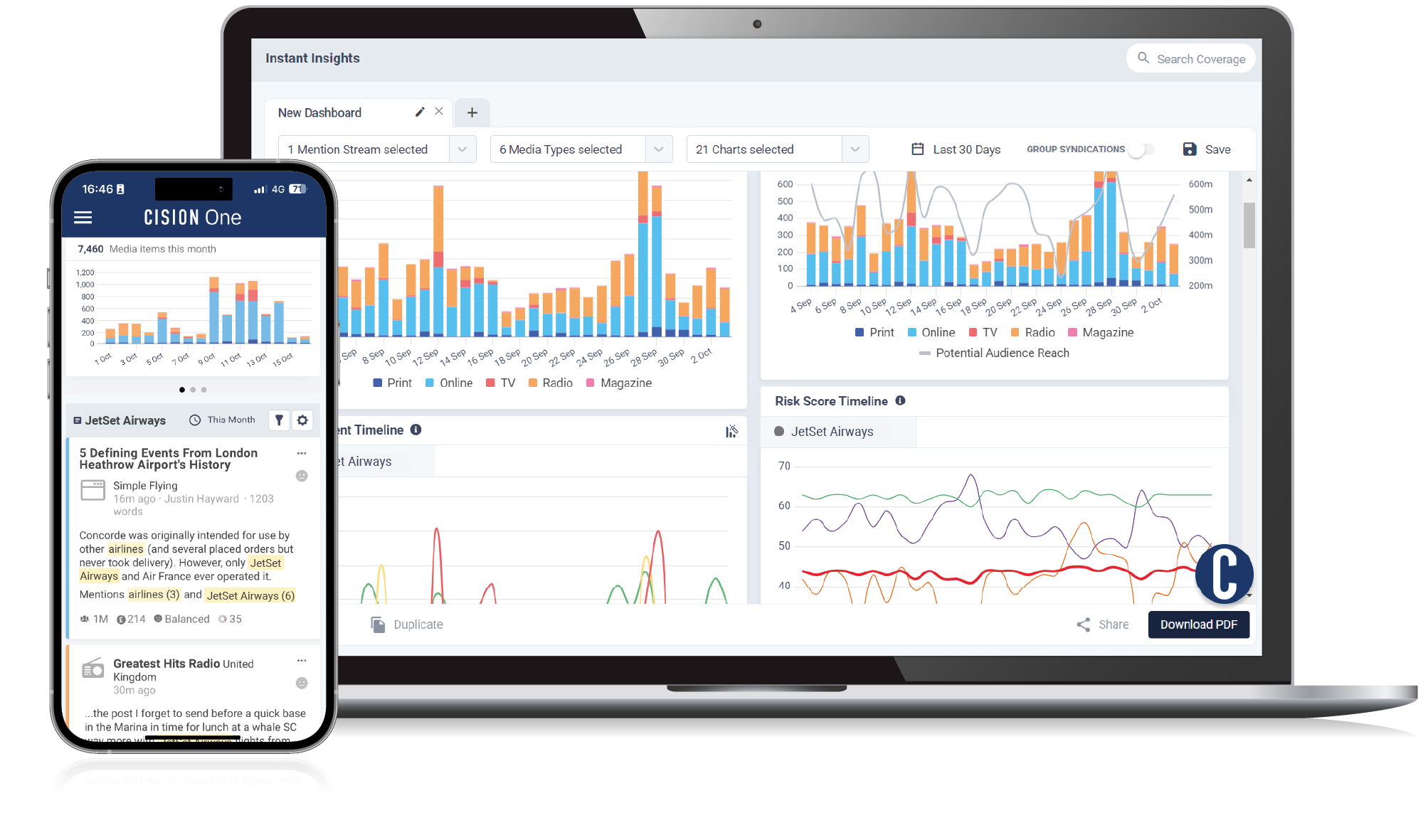
Another critical indicator of PR performance is media monitoring. A good media monitoring tool can help you understand if and how your efforts are moving the needle, enabling you to track such metrics as: number of media mentions, sentiment analysis, and audience reach.
For more on how to measure PR performance and what metrics are the most essential, check out these resources:
- Making It Count: A Step-by-Step Guide to Monitoring and Measuring the Impact of PR
- 7 Essential PR Metrics To Prove Impact
To find out how CisionOne Monitoring can help you track the impact of your PR efforts, explore the platform or schedule a demo today.


.png)